Explore Minnesota
Art Direction + UX/UI Design
-
What began as a marketing campaign identity, centered around the “Star of the North”, was expanded into a unified brand system for Explore Minnesota.
I translated the campaign concept into a structured visual identity system and extended it across digital, print, and internal and external communications. The system was then applied consistently across social media, email marketing, print collateral, and staff-facing templates to support day-to-day use across the organization.
The result was a more consistent and cohesive brand presence across channels, moving the identity from a campaign application to a repeatable system for ongoing use.
-
The existing identity needed to support a wider range of use cases than it was originally designed for. As adoption expanded across departments and channels, maintaining consistency across applications became increasingly difficult, particularly across decentralized, staff-created materials.
The core need was to establish a more structured system that could support ongoing communication needs across print, digital, and internal workflows while ensuring the identity remained cohesive and recognizable at scale.
-
The redesigned experience and expanded “Star of the North” brand system improved both digital engagement and organizational brand consistency across Explore Minnesota channels.
The website redesign contributed to increased user engagement, with average session duration improving, indicating stronger content discovery and improved usability.
The evolved brand system was successfully adopted across marketing and communications materials, extending beyond the original campaign scope into a cohesive visual identity used across web, print, and promotional channels.
The project established a more unified and flexible brand foundation, enabling Explore Minnesota to maintain consistent storytelling while supporting ongoing campaign and content needs.

Brand Foundation
The brand system formalized the “Star of the North” identity into a structured set of guidelines to ensure consistent use across Explore Minnesota applications.
It included refining logo usage and clear space rules, defining a typographic hierarchy with scalable applications, and expanding the color system for accessibility and digital use. Layout principles were established to support consistency across print and digital materials, along with guidance for maintaining visual tone across a range of use cases.
The system was designed to be flexible enough for everyday departmental needs while maintaining consistency across more polished campaign and marketing applications.


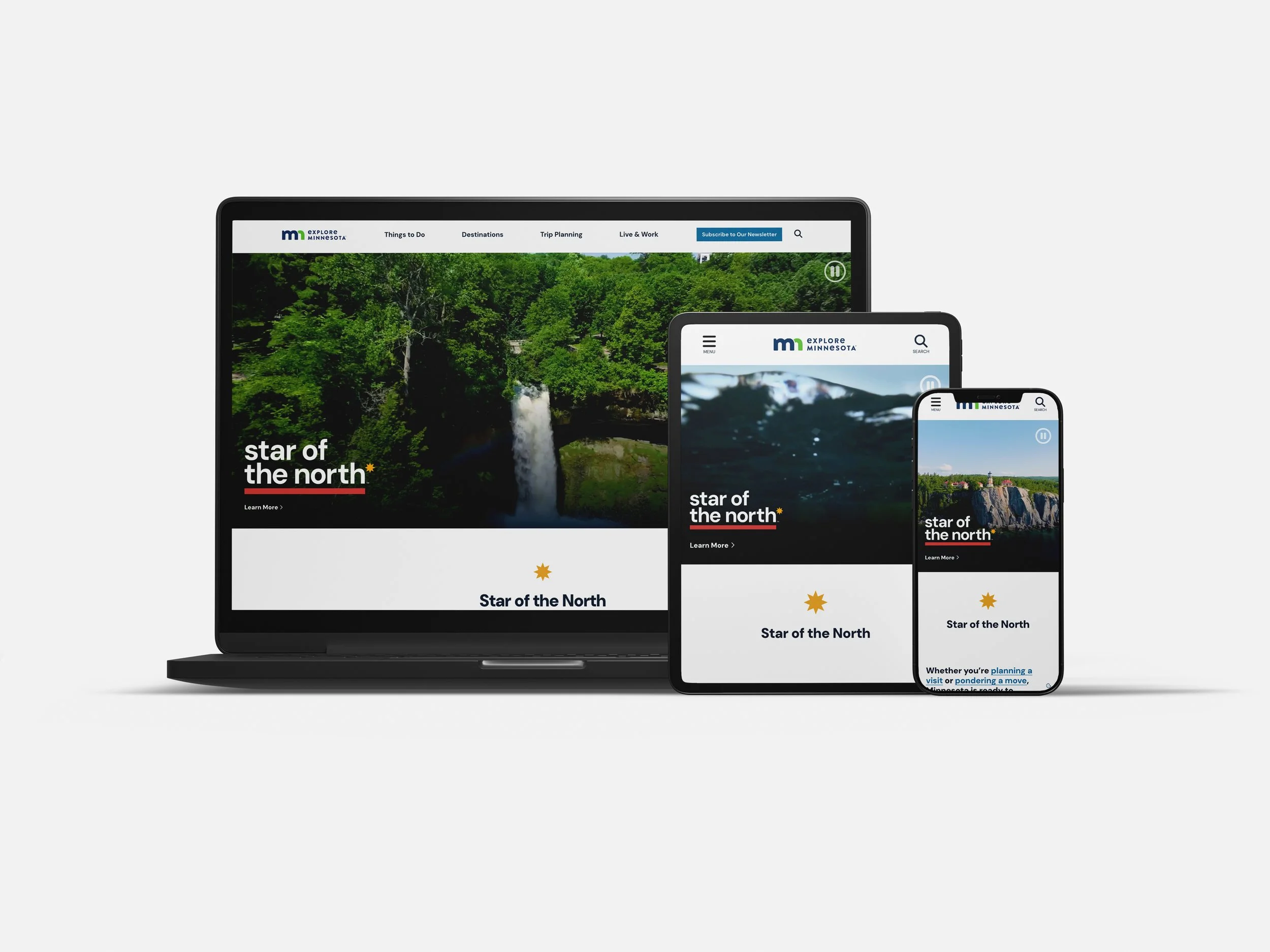
Digital Experience
The Explore Minnesota website serves as the organization’s primary public-facing platform for tourism content, trip planning, and statewide promotional initiatives.
I led the visual design of the redesigned experience, collaborating with the digital team on structure and implementation.
The redesign applied the updated brand system across all pages, improving navigation clarity, content hierarchy, and overall usability.
Early performance indicators showed improved engagement, including increased average session duration, even as overall traffic shifted due to changes in search behavior and reduced paid media investment.
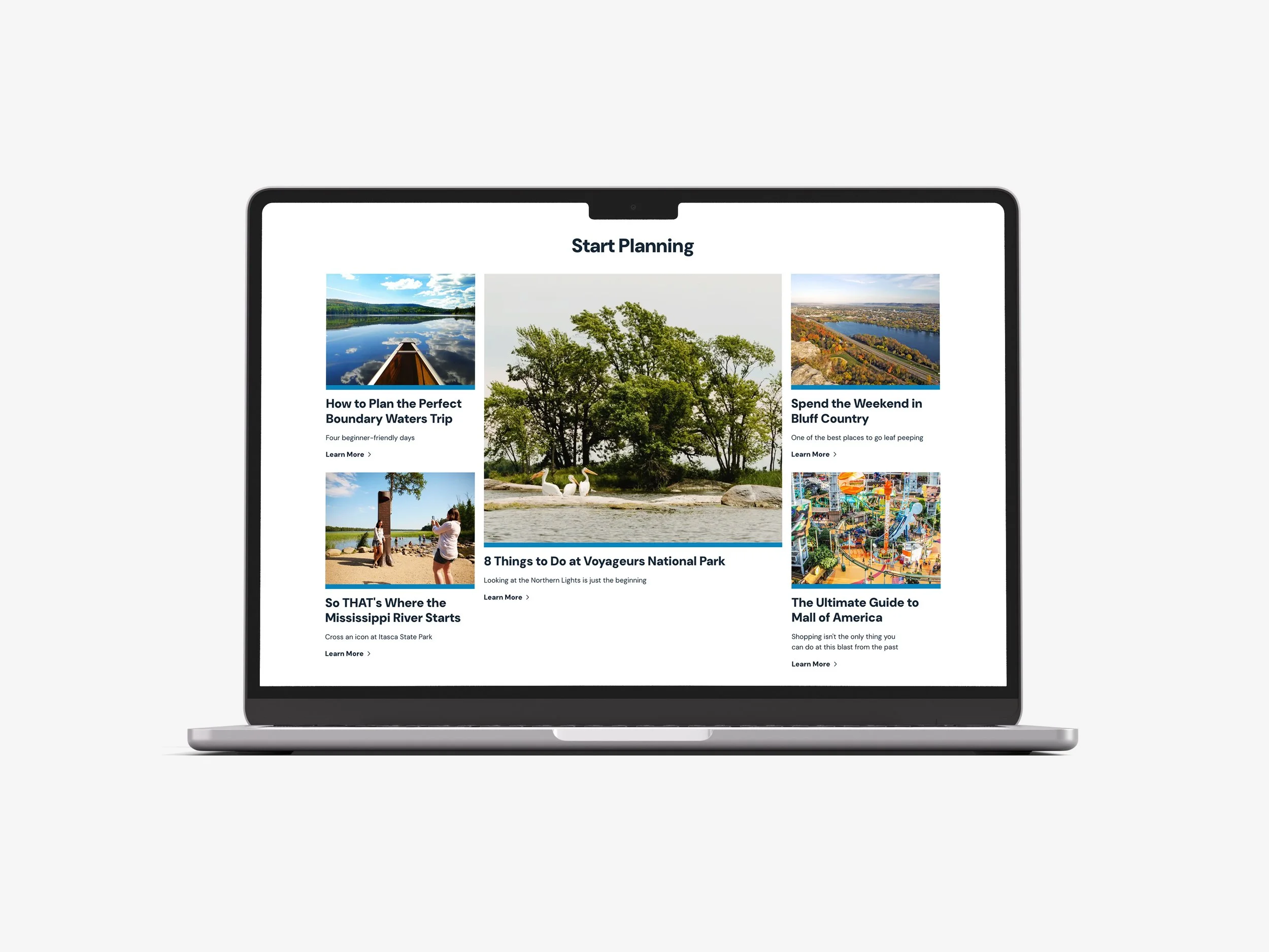
Applied brand system across modular layouts
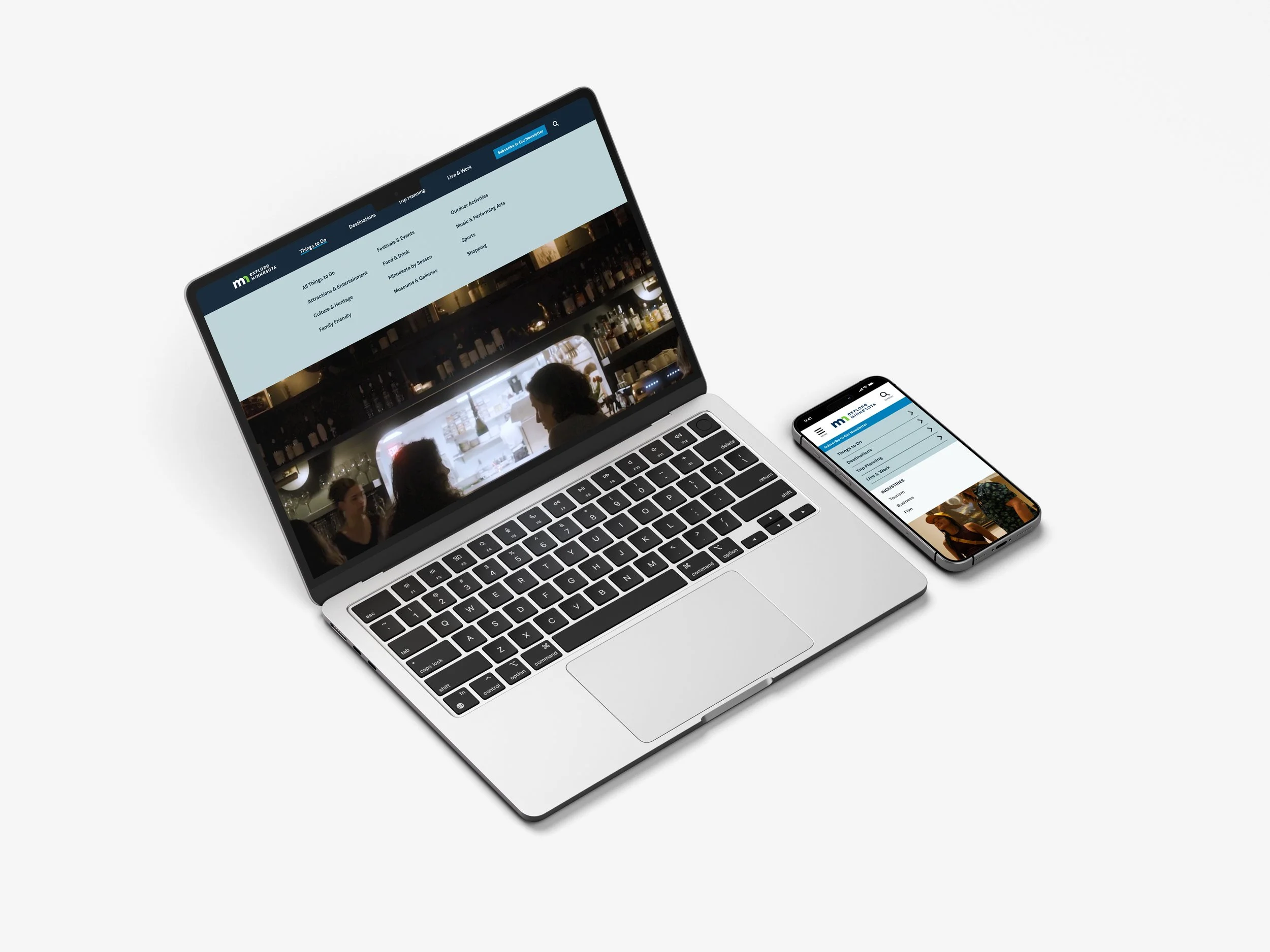
Simplified navigation structure

Improved content hierarchy

Social System
The social system extended the Star of the North brand across paid and organic social channels, translating the visual identity into flexible, high-performing content formats for diverse audiences and seasonal campaigns.
I developed a cohesive set of social templates and visual standards that enabled marketing teams to efficiently create on-brand content while maintaining consistency across platforms, including Instagram, Facebook, and digital advertising placements.
The system prioritized adaptability, enabling the brand to scale across different campaign themes (seasonal travel, regional highlights, and statewide storytelling) while preserving a unified visual language and tone.
Design decisions focused on clarity, accessibility, and mobile-first readability to ensure content performed effectively in fast-scrolling, attention-limited environments.


